A bit of background
Giliana is a mural art master, restorer, and professor of fresco techniques at the Accademia di Belle Arti in Bologna, where she also studied. Based in Modena, she has been transforming walls, ceilings, and spaces for over three decades: private residences for ultra-high-net-worth clients worldwide, luxury hospitality landmarks like Palazzo Parigi in Milan and Thornbury Castle in Gloucestershire, and heritage conservation projects carried out under the supervision of Italy's Soprintendenza.
Her work is not decoration. It is art made for architecture, conceived, designed, and executed by hand, and enhanced by patented technology she developed herself to allow large-scale mural work to be produced in the atelier and installed on site without compromising artistic integrity.
I first worked with Giliana in 2013. In 2016 I produced a video documenting her work.
By 2024, the studio had grown significantly and was pursuing international expansion in earnest. It was time to build a brand equal to the work.
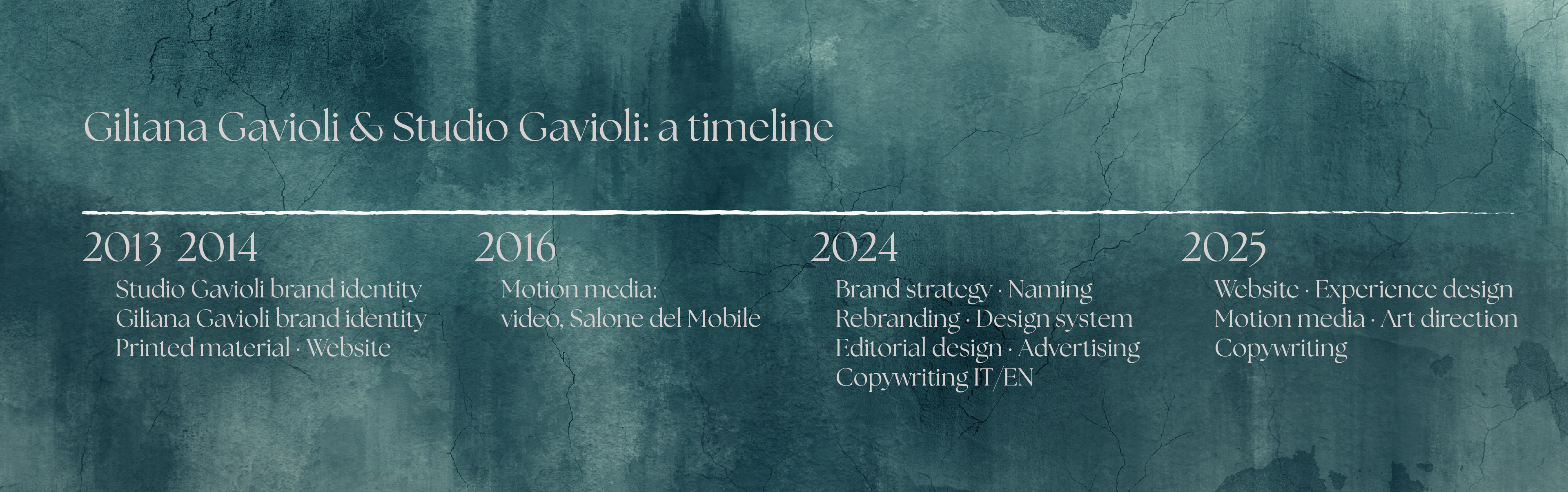
2024 - The strategic challenge
Studio Gavioli's portfolio spanned radically different types of work: intimate bespoke commissions for private collectors, large-scale contract projects for luxury hotels, hands-on atelier production, rigorous scientific restoration. All exceptional. All, until that point, presented under a single undifferentiated brand.
The market analysis confirmed what the work itself suggested: the studio's ideal clients, from ultra-high-net-worth private clients to luxury hospitality groups to prestigious cultural institutions, each needed to be addressed with a different language, a different emphasis, a different set of promises.
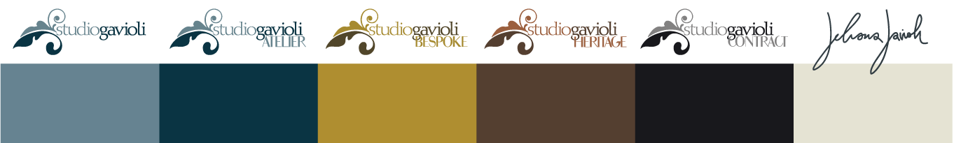
The decision was to move from a single brand to a structured brand system: one master identity, four distinct lines, each with its own positioning, colour, and voice, all coherent, all unmistakably Studio Gavioli.
The four lines:
ATELIER: the physical and technological heart of the studio's production. BESPOKE: fully custom work for the most demanding private clients. HERITAGE: scientific restoration and conservation. CONTRACT: high-end B2B, with a focus on luxury hospitality and the HORECA sector.
You can read more about the strategy and the naming here: https://portfolio.raffaellaisidori.com/naming-strategy-rebranding-studio-gavioli-modena-it
You can read more about the strategy and the naming here: https://portfolio.raffaellaisidori.com/naming-strategy-rebranding-studio-gavioli-modena-it
You can read more about the strategy and the naming here: https://portfolio.raffaellaisidori.com/naming-strategy-rebranding-studio-gavioli-modena-it
2024 - The brand system
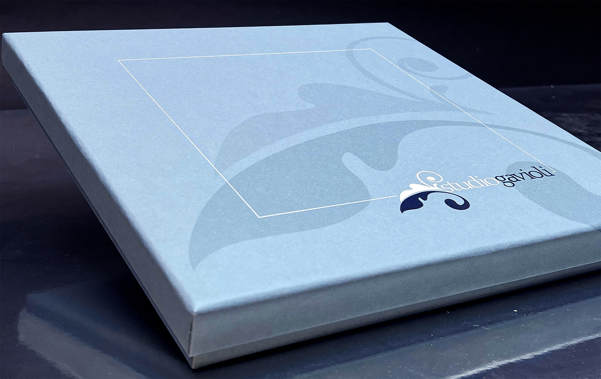
The 2013 logotype, built on the ornamental scroll motif drawn from the tradition of decorative arts, remained the anchor. It had equity, it was recognisable, and it was right.
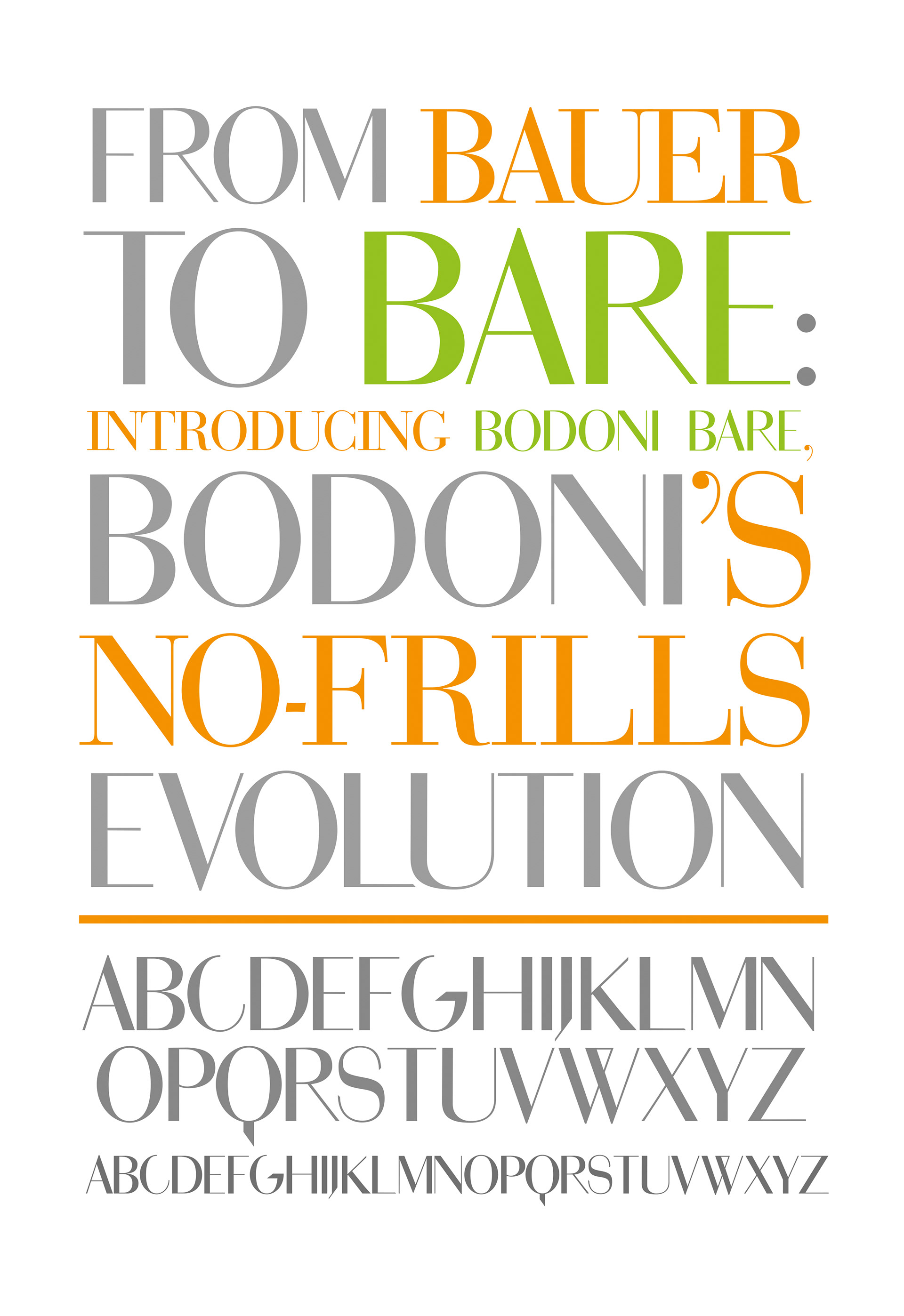
Each of the four lines received its own logotype variant: the Studio Gavioli mark paired with a sub-brand name set in Bodoni Bare, a typeface I designed in 2013 that brings rigour and precision alongside the more organic warmth of the original mark.
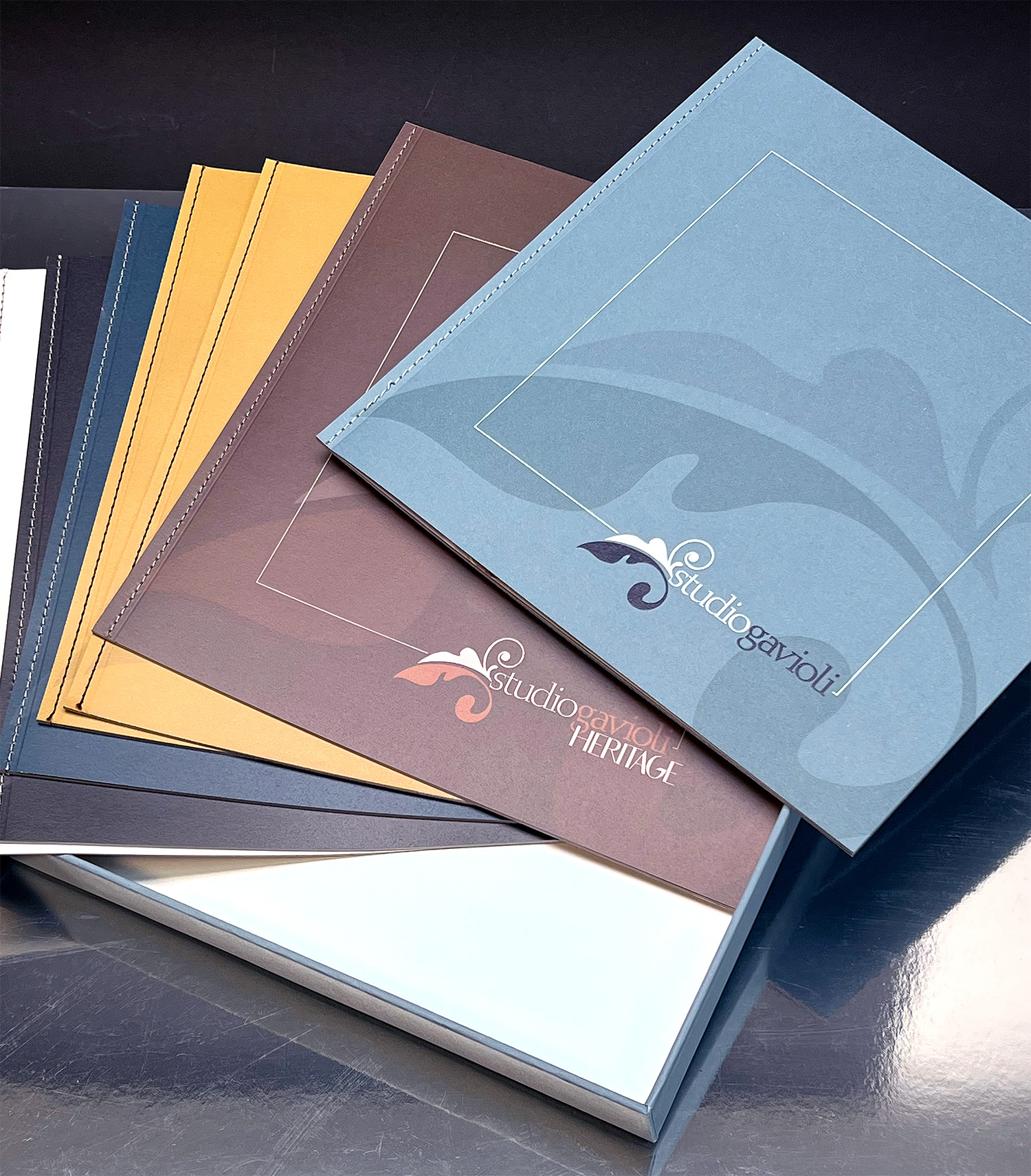
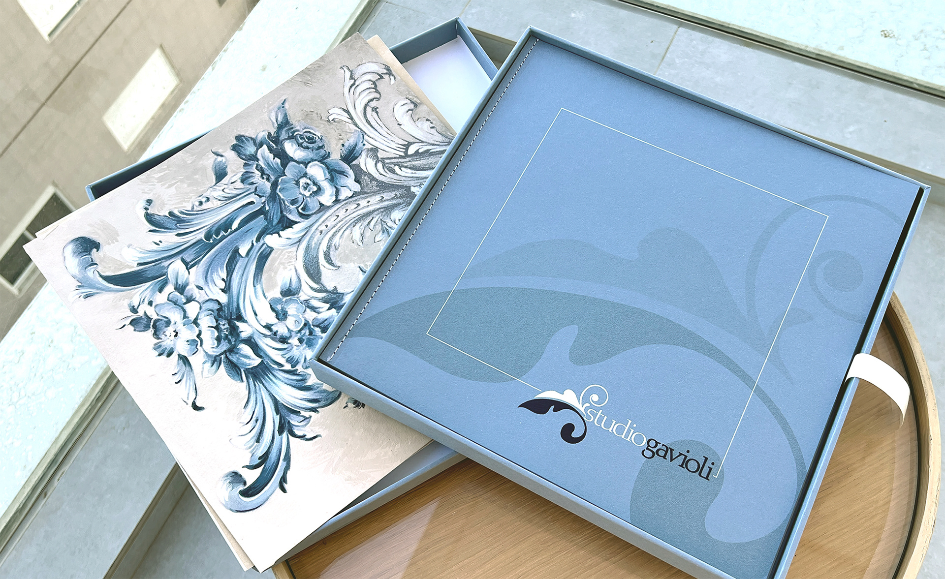
Each line also received a dedicated colour: a dusty blue for ATELIER, a warm gold for BESPOKE, a deep brown for HERITAGE, a near-black for CONTRACT. These colours run through every touchpoint, from brochure covers to website sections, giving each line its own visual territory while maintaining the coherence of the whole.
The result is a coherent design system: a master identity articulated across four distinct lines, each with its own logotype, colour, and voice, all sharing the same visual DNA. The full brand system was delivered in January 2025.
You can read more about the visual rebranding here: https://portfolio.raffaellaisidori.com/rebranding-studio-gavioli-modena-it
And about Bodoni Bare here: https://portfolio.raffaellaisidori.com/bodoni-bare
You can read more about the visual rebranding here: https://portfolio.raffaellaisidori.com/rebranding-studio-gavioli-modena-it
And about Bodoni Bare here: https://portfolio.raffaellaisidori.com/bodoni-bare
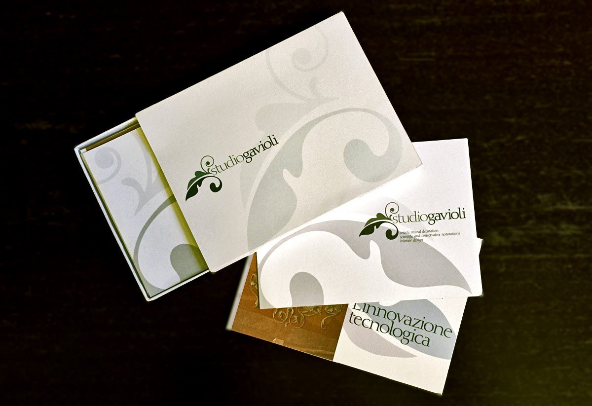
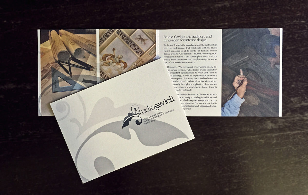
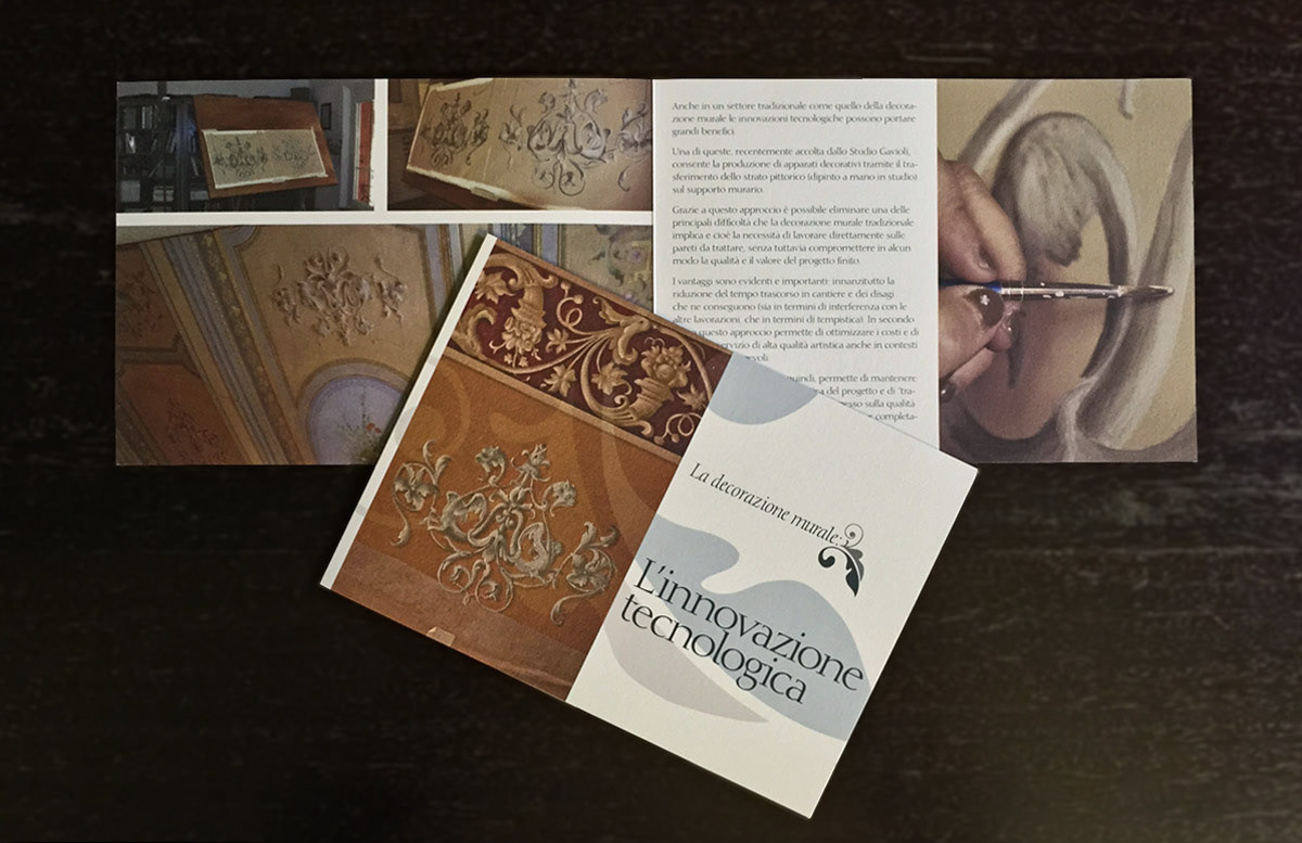
2025 - The monograph & the brochures
A brand system of this quality needed a physical expression to match.
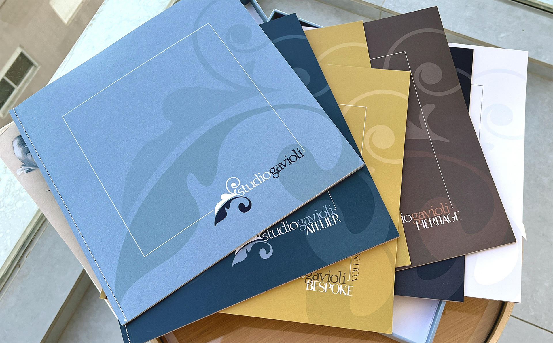
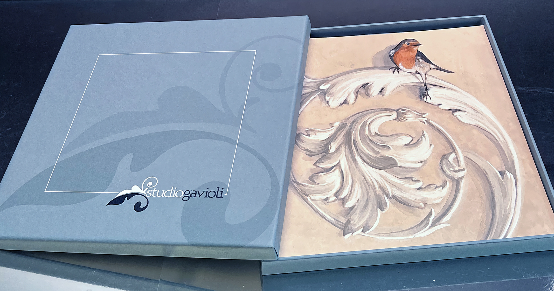
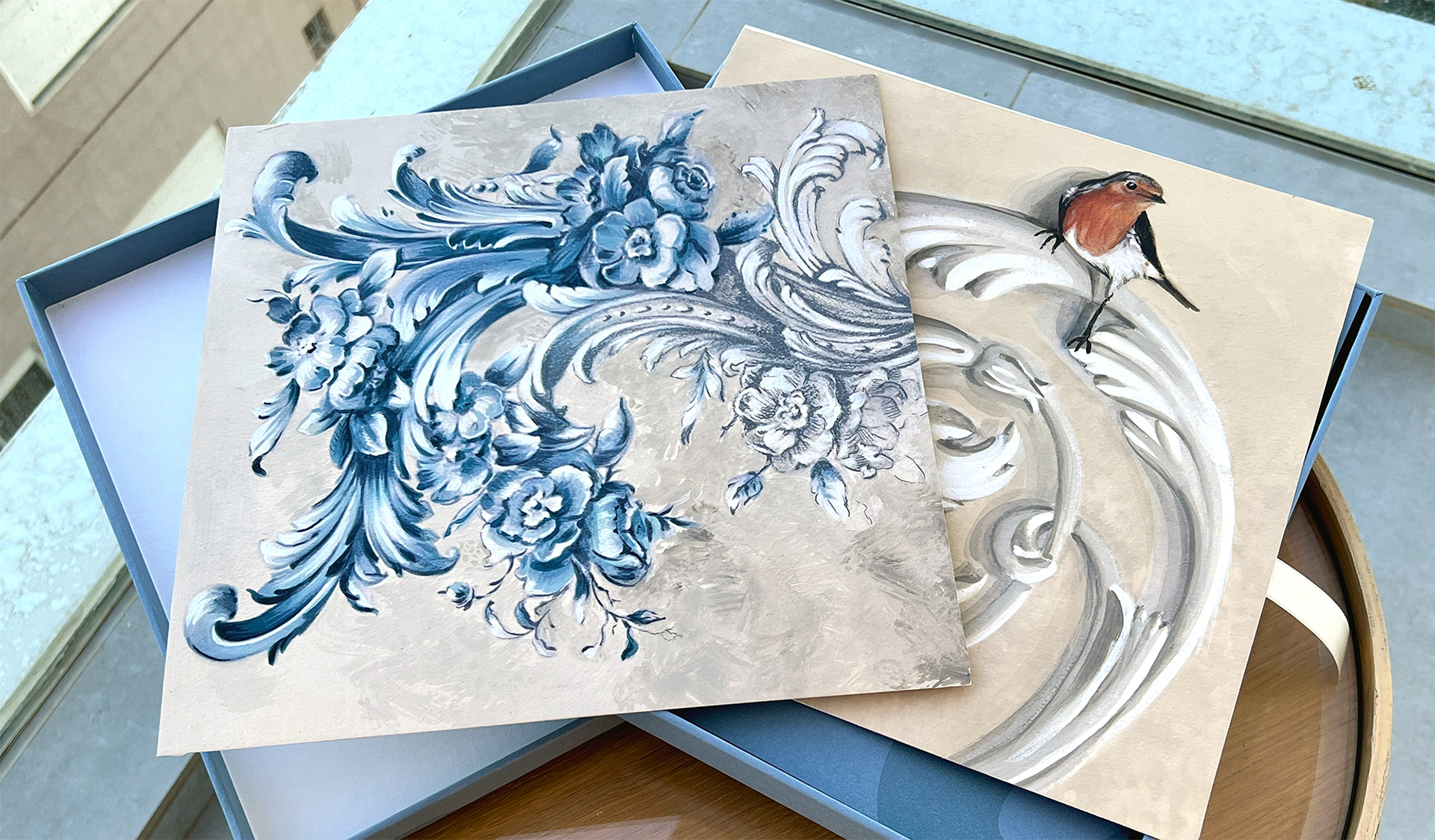
I designed a modular monograph: a hardcover presentation box containing seven individual brochures, one for each line, plus a Studio Gavioli overview and a brochure dedicated to Giliana Gavioli herself.
Each brochure works as a standalone piece and as part of the whole, meaning the box can be presented in full or individual brochures can be selected for specific client contexts.
To make the object genuinely precious, and to embody the studio's values from the very first touch, each box contains two original hand-painted samples of Studio Gavioli's work.
I designed, art-directed, and wrote all content for all seven brochures, in both Italian and English. Printed on Fedrigoni Xper and Materica papers by Lito Group, with singer-sewn binding.
You can read more about the monograph here: https://portfolio.raffaellaisidori.com/monograph-brochure-studio-gavioli-2025-modena-it
And explore the single brochures here: https://portfolio.raffaellaisidori.com/single-brochures-studio-gavioli-2025-modena-it

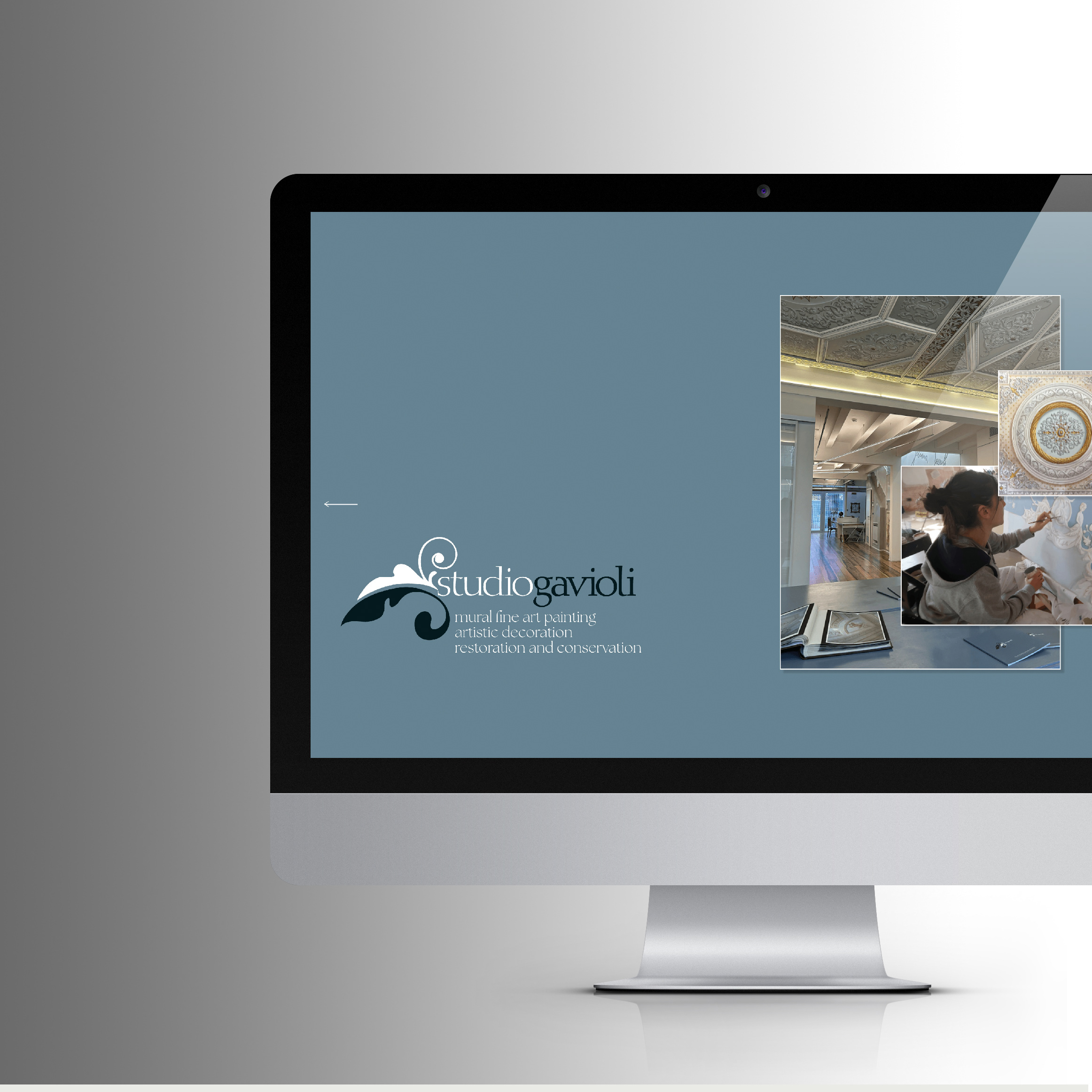
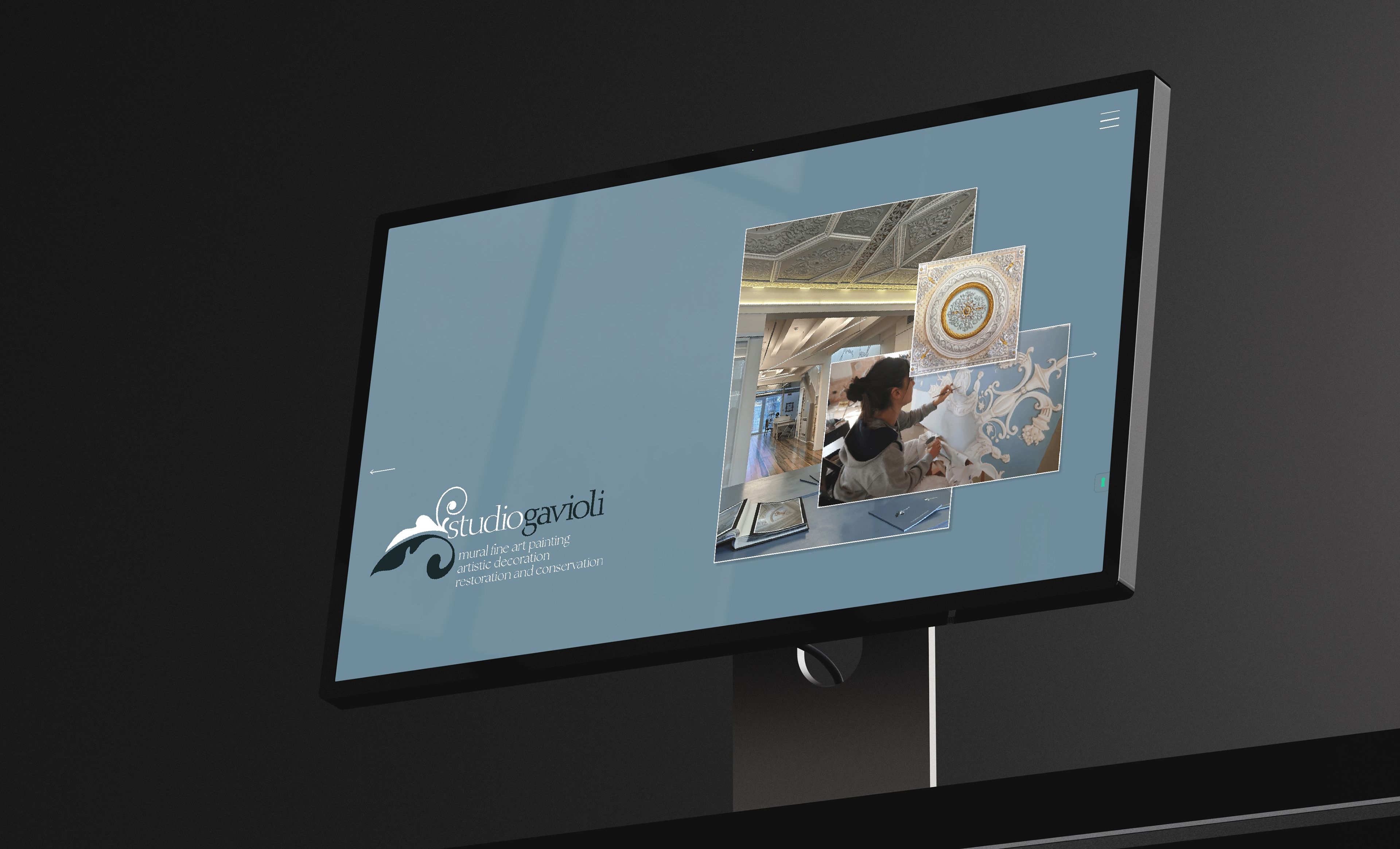
2025 - The website
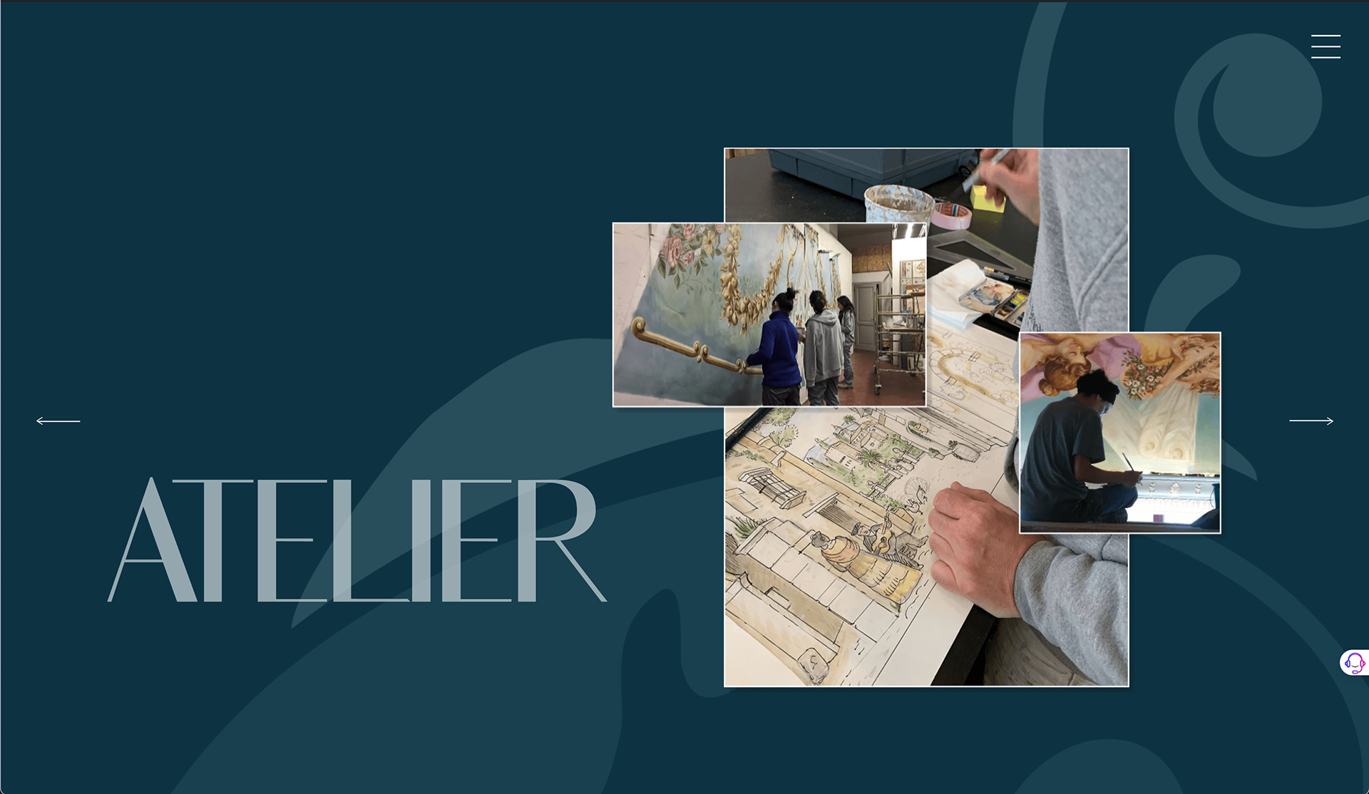
The monograph set the visual and editorial compass for the website, which extended the same logic into a digital experience.
The site, designed and art-directed by me and developed by UpUp, is bilingual (Italian and English), fully responsive, and built on WordPress. It presents Studio Gavioli and each of its four lines with the same visual language established in print: palette, typography, editorial voice. The landing section communicates the full scope of the studio at first glance; each line then receives its own dedicated space.
The site includes an accessibility declaration and meets near-complete W3C AA standards, not a legal requirement for this type of client, but a choice consistent with the studio's values of precision and care.
Read more about the experience design of Studio Gavioli's website here: https://portfolio.raffaellaisidori.com/website-experience-design-studio-gavioli-modena-italy
2025 - Motion Media
Alongside the print and digital materials, I produced a video for Studio Gavioli - concept, art direction, and editing - designed to translate into moving image the visual mood established across the brand system. The soundtrack was also produced by me, using AI-assisted music generation.
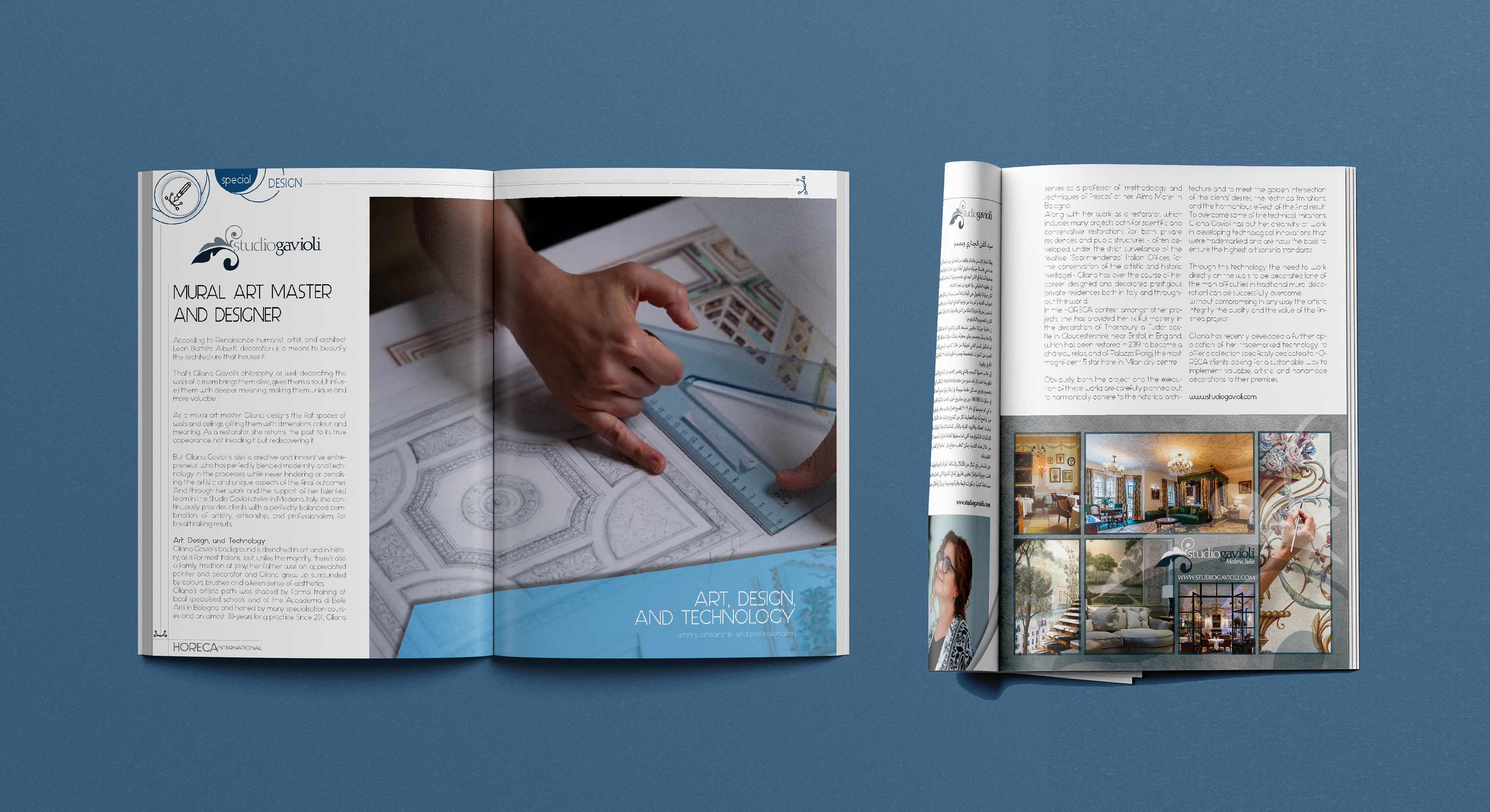
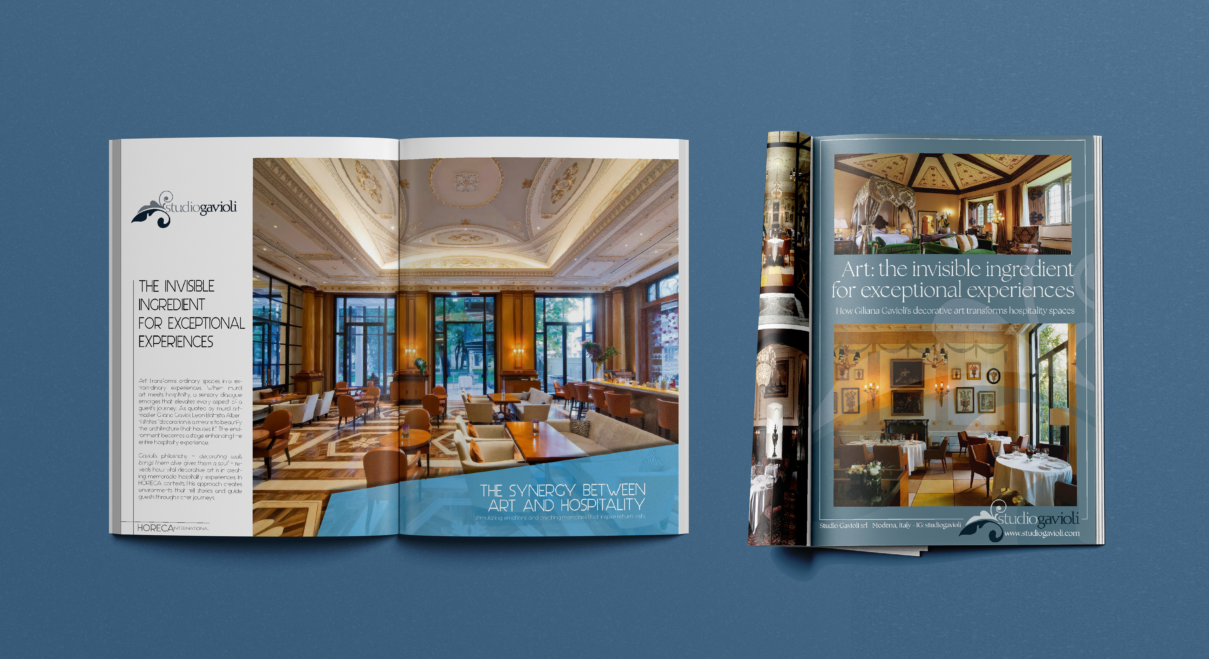
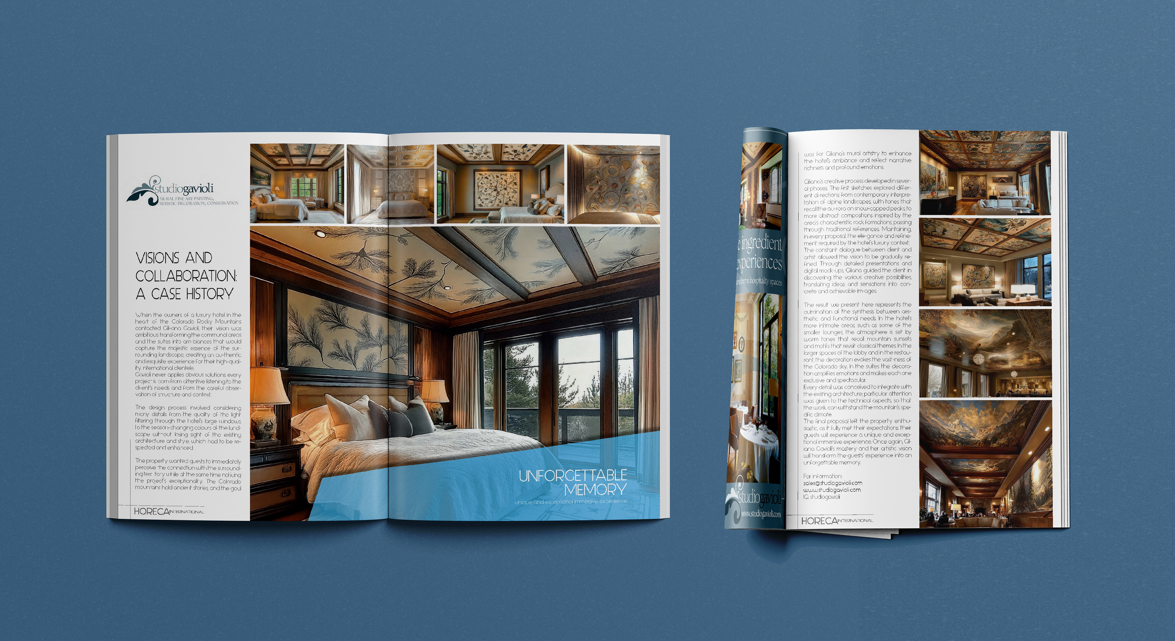
2024-2025 - B2B Advertising
The market analysis had identified the HORECA sector as a strategic priority for Studio Gavioli's positioning and growth. As part of a deliberate effort to increase visibility in that context, I conceived and produced three advertising insertions for the leading Italian HORECA trade press: strategy, art direction, and copywriting, with layouts and content developed specifically to promote the Studio Gavioli CONTRACT line in the context of key sector trade fairs.
2016 - motion media
In 2016, on the occasion of the Salone del Mobile in Milan, I produced a video documenting Giliana's work: concept, art direction, editing, and some photography, with 3D renderings by Arsen Durgaryan. The piece captured the breadth and quality of her practice at that point in time, and served as a tool for presenting the studio in professional and trade contexts.
2013/2015 - Where we started
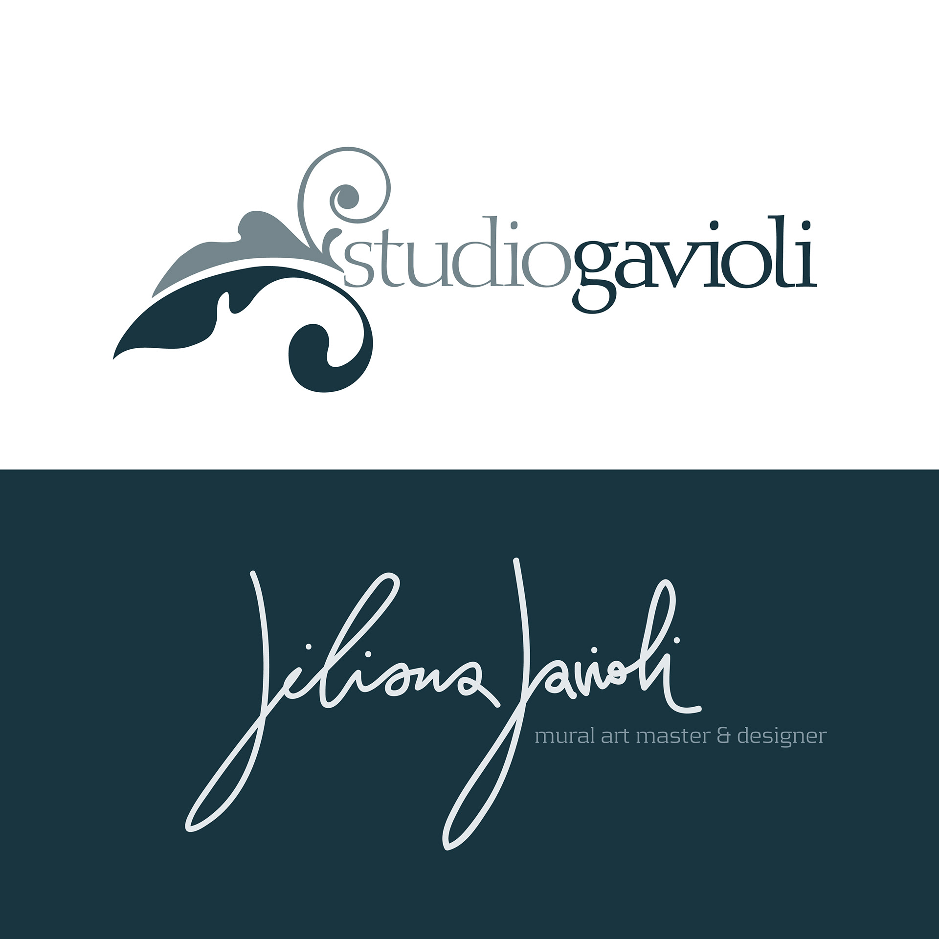
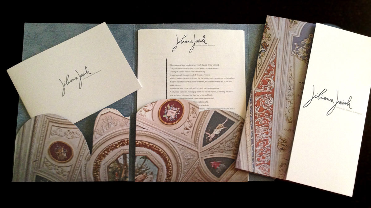
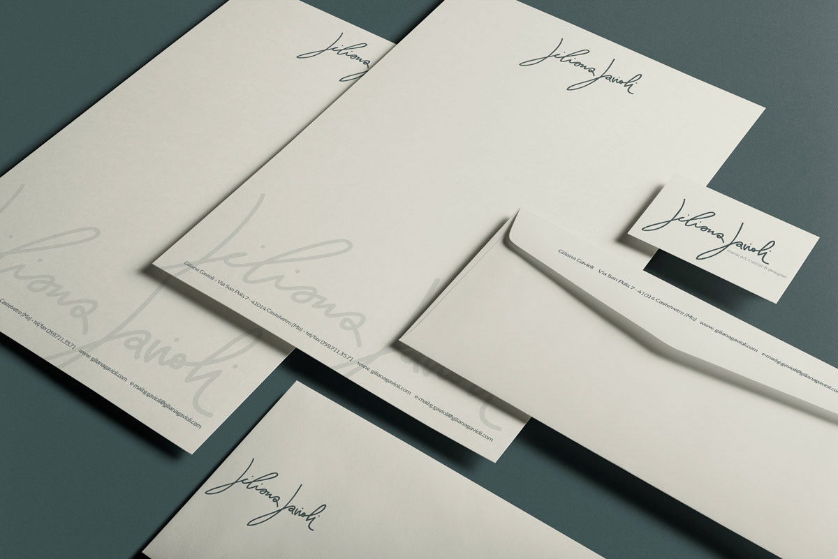
My first collaboration with Giliana Gavioli dates back to 2013, when I first defined a brand strategy and designed two distinct yet synergetic brand identities: one for Studio Gavioli as a studio, and one for Giliana Gavioli as an artist.
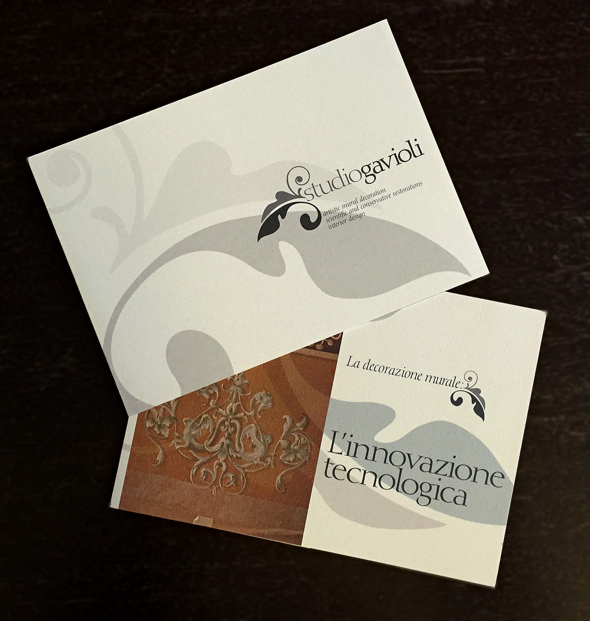
The distinction was deliberate and strategic. The Studio Gavioli logotype, built around a decorative scroll motif drawn from the visual language of traditional fresco and decorative arts, communicated the artisanal roots and artistic ambition of the studio as an entity.
The Giliana Gavioli logotype carried a different weight: the personal mark of an artist, a signature in its own right, conceived to position Giliana's individual name and profile as a value in itself, distinct from and complementary to the studio brand.
The Giliana Gavioli logotype carried a different weight: the personal mark of an artist, a signature in its own right, conceived to position Giliana's individual name and profile as a value in itself, distinct from and complementary to the studio brand.
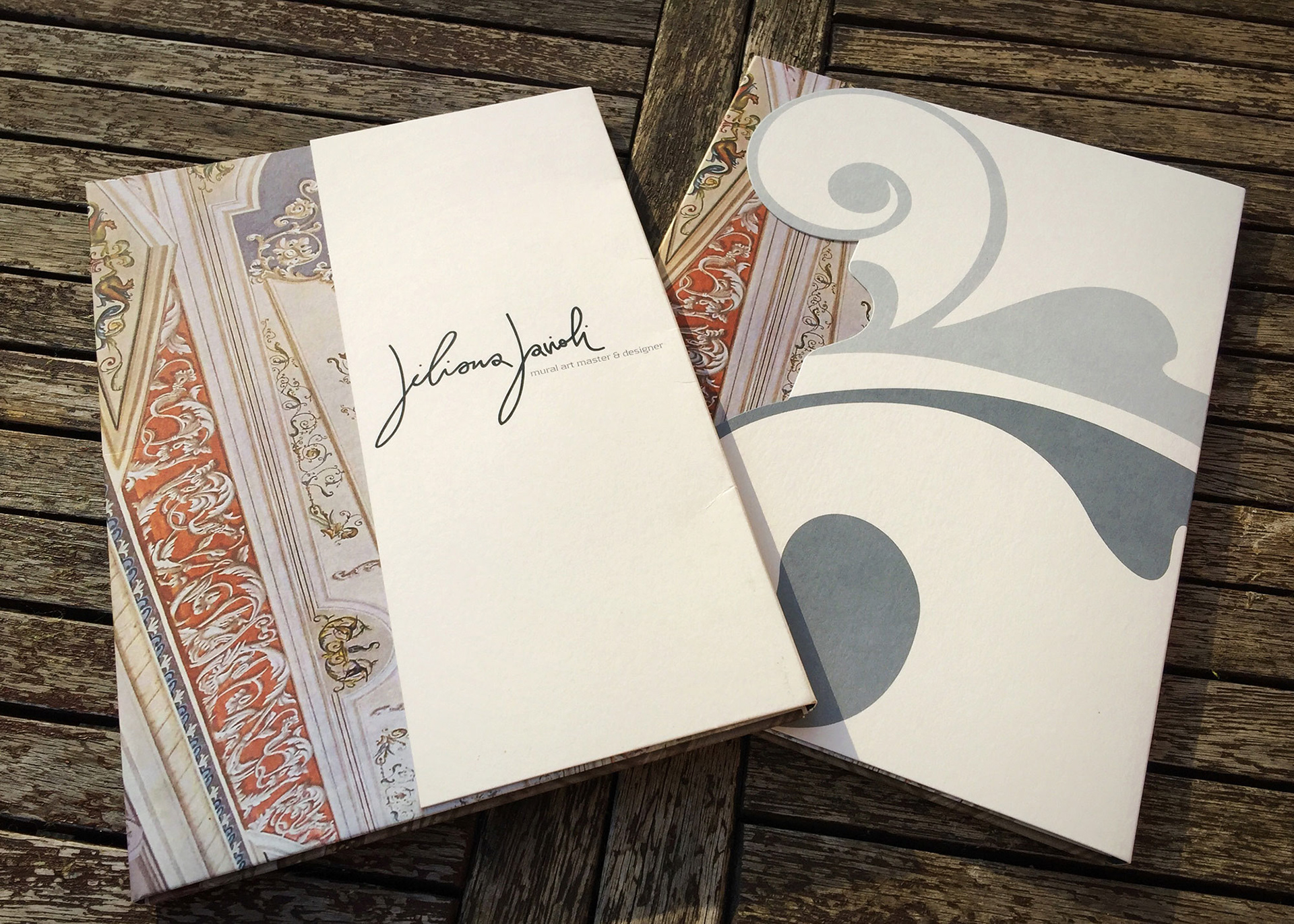
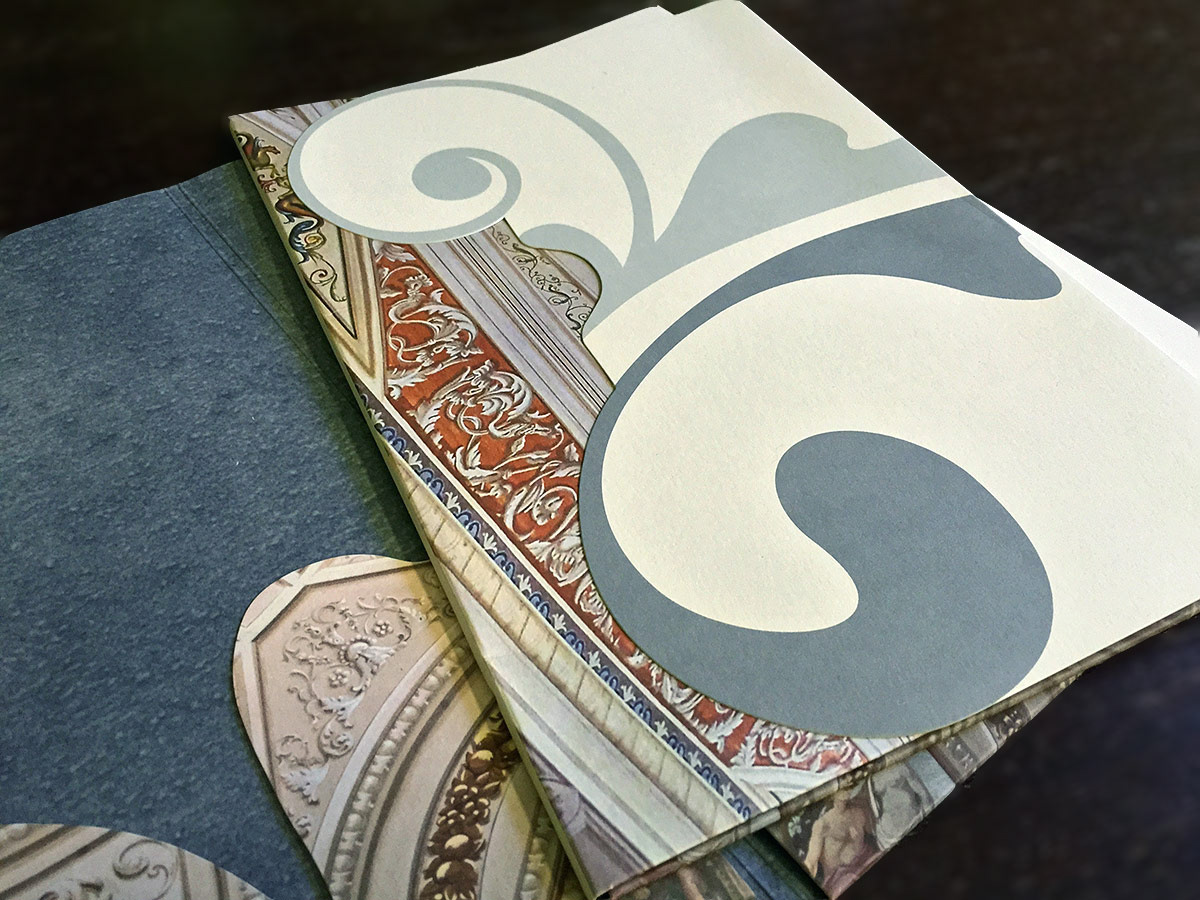
Both identities were accompanied by printed materials and a web presence. The printed presentation folders were designed as a system to optimise production costs: same interior, same graphic motif (a large-scale decorative scroll drawn from the visual language of the work itself), but two distinct covers with different finishes.
The Studio Gavioli folder features a die-cut of the logotype's scroll glyph on a powder blue cover, the colour that would go on to become Studio Gavioli's brand blue. The Giliana Gavioli folder uses a binding cut with the logo on a white cover.
One print run, two identities, two distinct personalities. Both informed everything that came after.
You can explore the Studio Gavioli 2013 identity here: https://portfolio.raffaellaisidori.com/studio-gavioli-modena-branding-2013-2015
And the Giliana Gavioli identity here: https://portfolio.raffaellaisidori.com/giliana-gavioli-2013
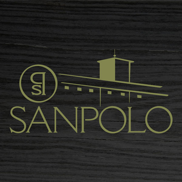
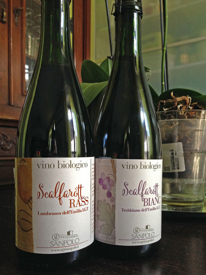
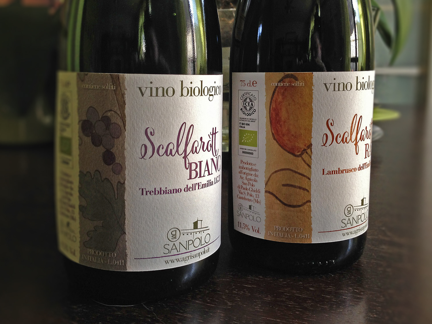
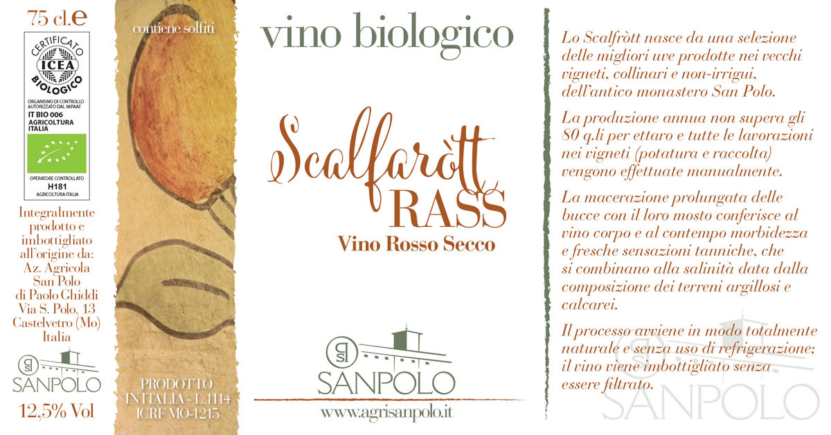
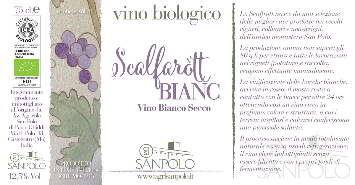
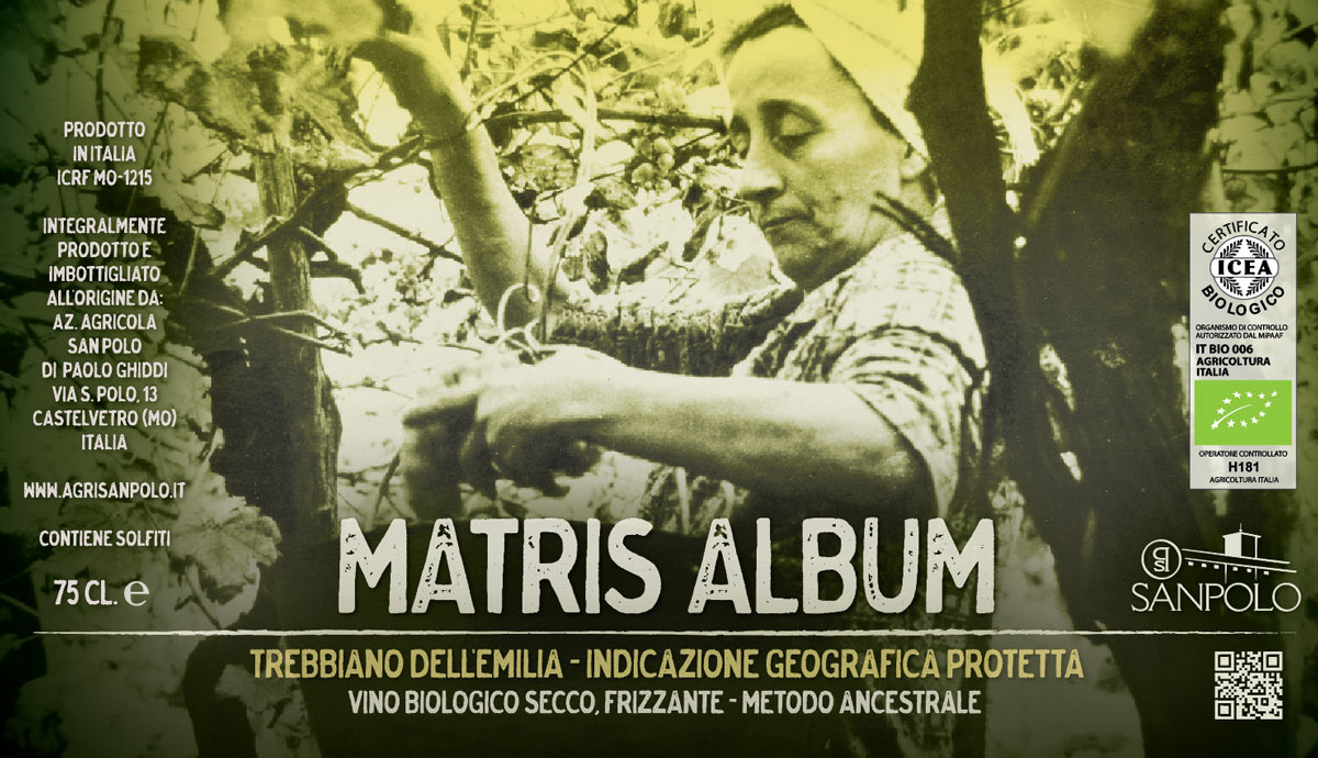
The relationship with Giliana extended to her husband Paolo's organic winery, Az. Agr. Sanpolo in Castelvetro, for which I first designed the brand identity.
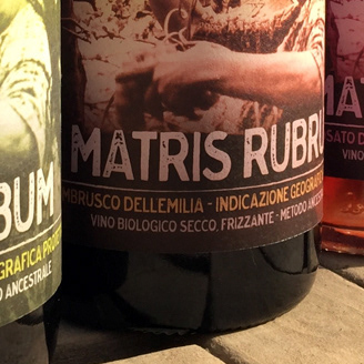
For the Scalfaròtt wine label line I drew directly on Giliana's artwork, a natural choice and a small example of how a working relationship can grow beyond its original scope.
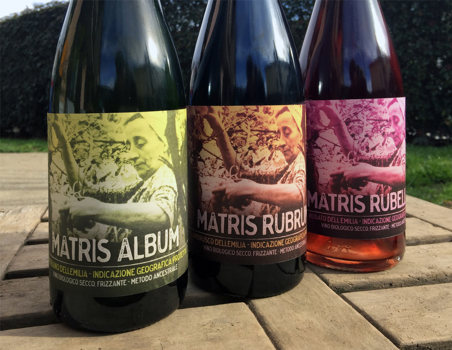
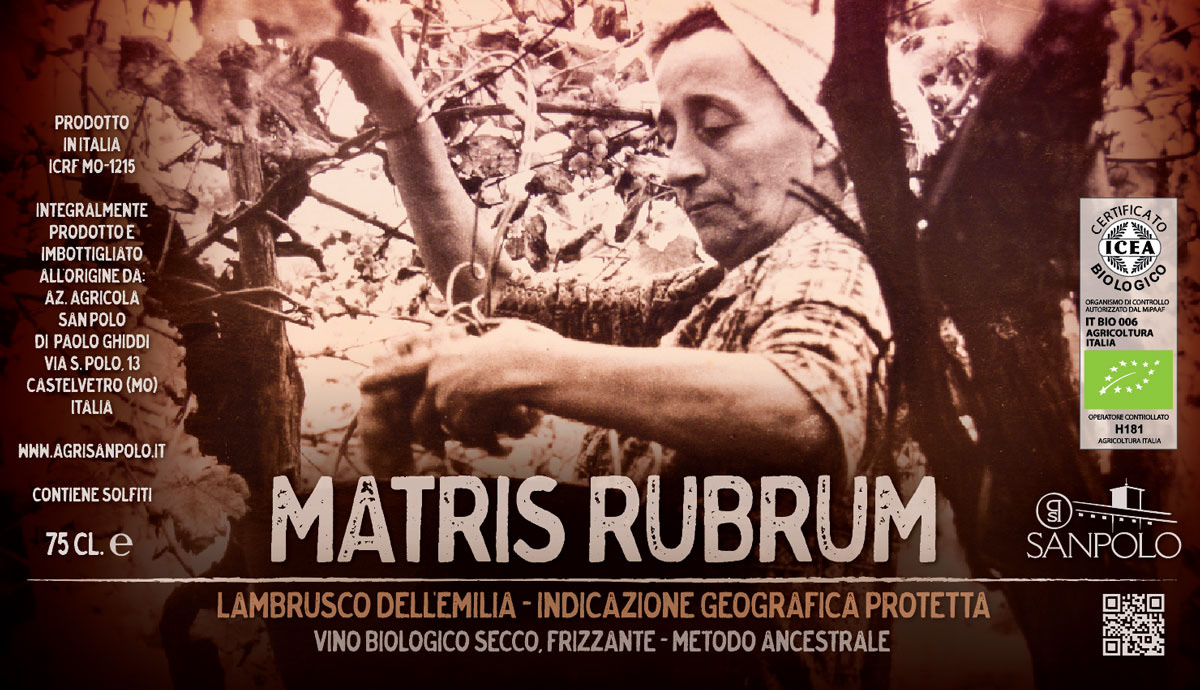
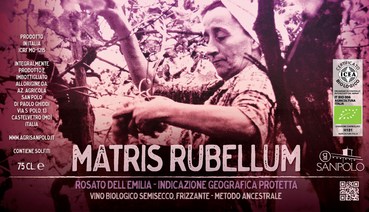
A second collaboration followed with the Matris line: from the brief of integrating the owner's mother's photographs, I developed the full concept, the line name (Matris), its declinations (Rubrum, Album, Rubellum), and the graphic design of the labels.
More about these projects here:
San Polo, identity: https://portfolio.raffaellaisidori.com/azienda-agricola-sanpolo
Scalfarott line: https://portfolio.raffaellaisidori.com/scalfarott-wine-labels-az-agr-sanpolo
San Polo, identity: https://portfolio.raffaellaisidori.com/azienda-agricola-sanpolo
Scalfarott line: https://portfolio.raffaellaisidori.com/scalfarott-wine-labels-az-agr-sanpolo
Matris: naming (https://portfolio.raffaellaisidori.com/naming-matris-wine-labels), and packaging design (https://portfolio.raffaellaisidori.com/matris-wine-labels)