GI Consulting is a professional services firm based in Lecco, Italy, founded in 2009 by Roberto Geronimi and Mauro Invernizzi. I have been working with them since the beginning, and with Mauro Invernizzi since the early 2000s.
By 2023 the firm had grown well beyond its original perimeter, with separate companies covering distinct areas of practice. That was when I started envisioning a modular brand architecture: one group, several divisions, each with its own identity and its own place within a coherent whole. The 2025 rebranding is where that proposal took form.
the identity system
Six divisions: Consulting, Labor, Finance, Services, Legal, Growth. Each received a dedicated logotype pairing the "gi" ligature with the division name, and a dedicated colour drawn from a palette designed to work both independently and as a coherent whole.
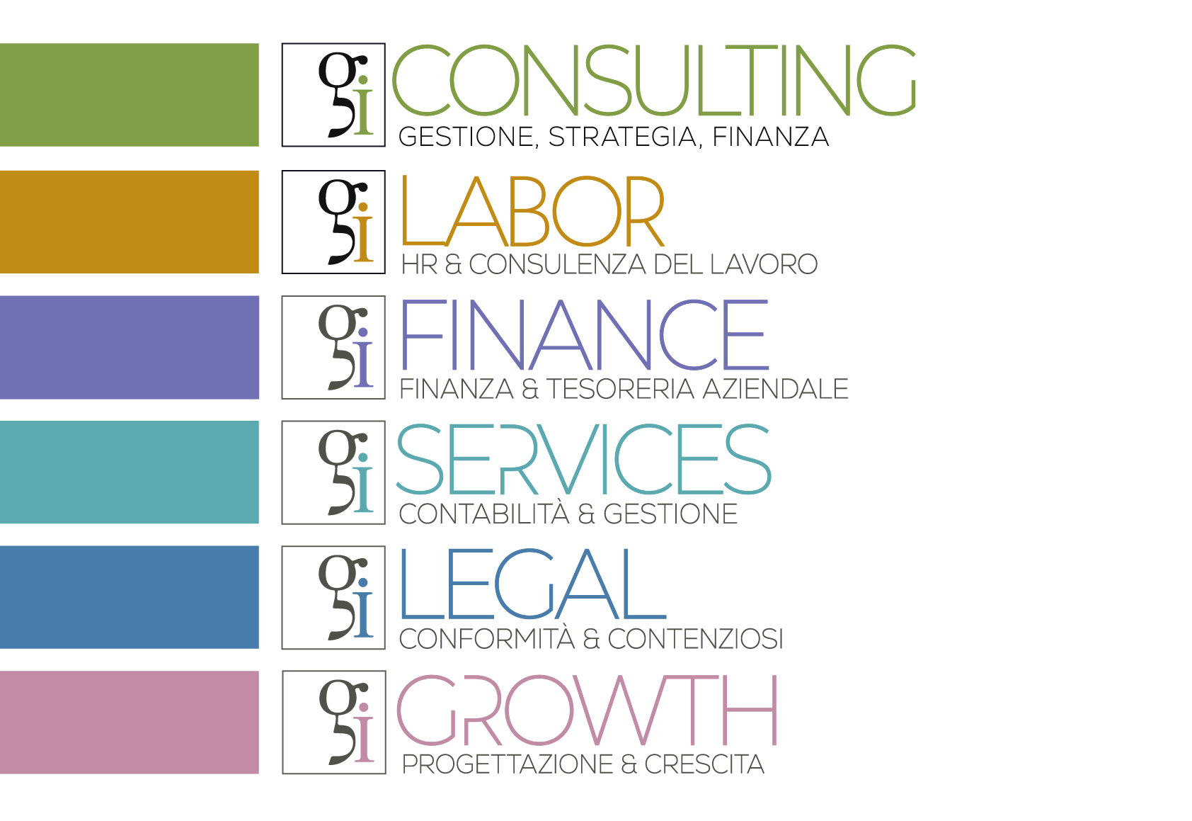
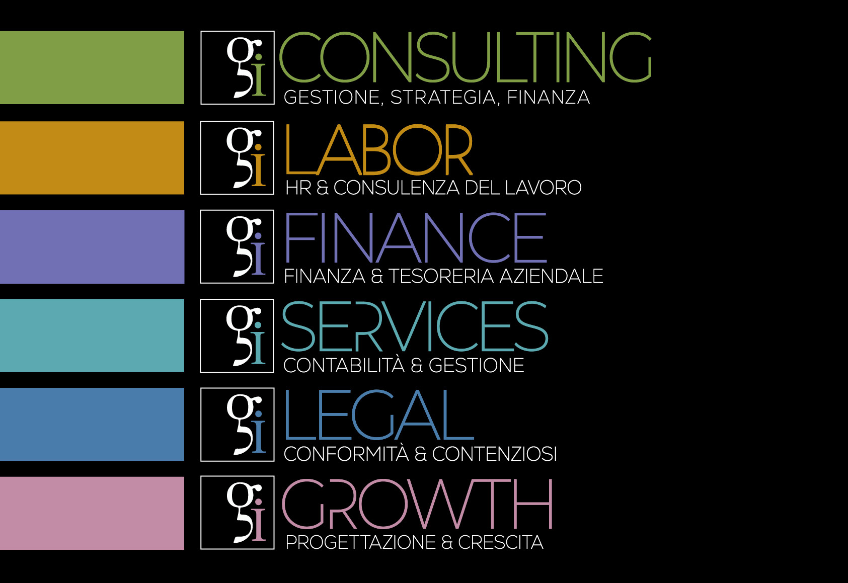
Each logotype was produced in a full set of variants: reduced sizes, where the ligature needs to hold together at a few millimetres; large formats, where the same proportions have to work on signage; and dark backgrounds, which required their own colour treatment rather than a simple inversion.
The palette was checked for contrast and legibility across all of these conditions, so that each division colour remains readable in print, on screen, and in the physical environment.
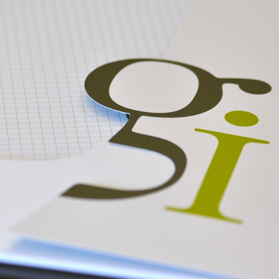
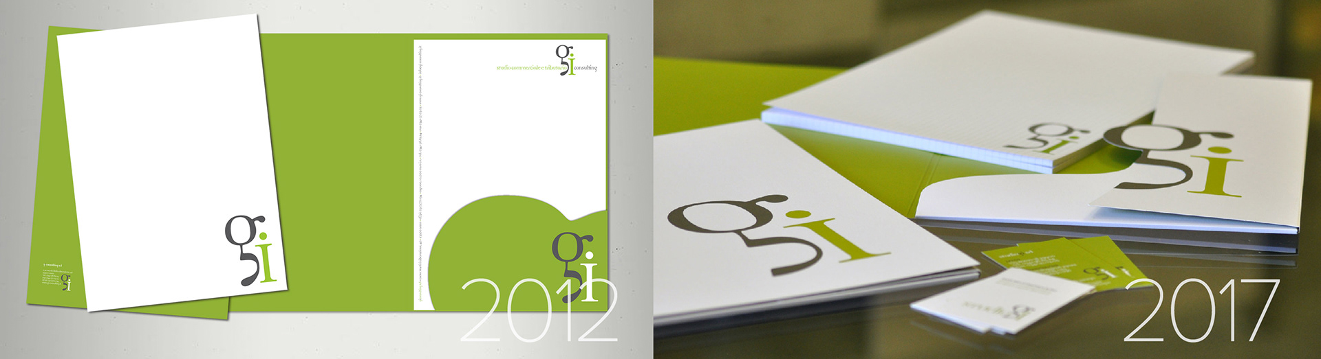
The "gi" ligature, designed in 2009 and reworked in 2017, is the constant. It had earned its recognisability and there was no reason to lose it. What changed is everything built around it.
the symbolic system
Professional services firms tend to look alike. The visual vocabulary of the sector is narrow, and the values these firms declare are largely the same set of words. I was looking for a language that could carry meaning on more than one level at once: distinguish six divisions, say something specific about each, hold the group together, and speak of the territory the firm belongs to, which is one of the values its own copy declares.
And the answer came from the territory itself: the fauna typical of the province of Lecco and of the Valtellina region, populated by animals symbolic of the qualities the group represents. The vision of the eagle, the intelligence of the fox, the industriousness of the bee, the trustworthiness of the Saint Bernard. The associations were already deeply rooted in Italian culture, and so shared and immediate.
From there the work moved division by division: identifying the three primary values that define each one, and then finding the animal that carries each value most directly. Every pairing is completed by a short phrase that states what the value means in practice.
These associations hold because they resonate, culturally and in reality. This allows the system to be read instantly, without explanation, and lets the territory speak for itself without ever being named.

GI Consulting: eagle (vision), lynx (strategy), trout (resilience)

GI Labor: bee (collaboration), chamois (agility), beaver (competence)

GI Finance: falcon (foresight), ibex (stability), squirrel (planning)

GI Services: ant (method), horse (reliability), Saint Bernard (assistance)

GI Legal: fox (intelligence), owl (counsel), bear (protection)

GI Growth: spider (design), deer (growth), pike (impact)
the applications
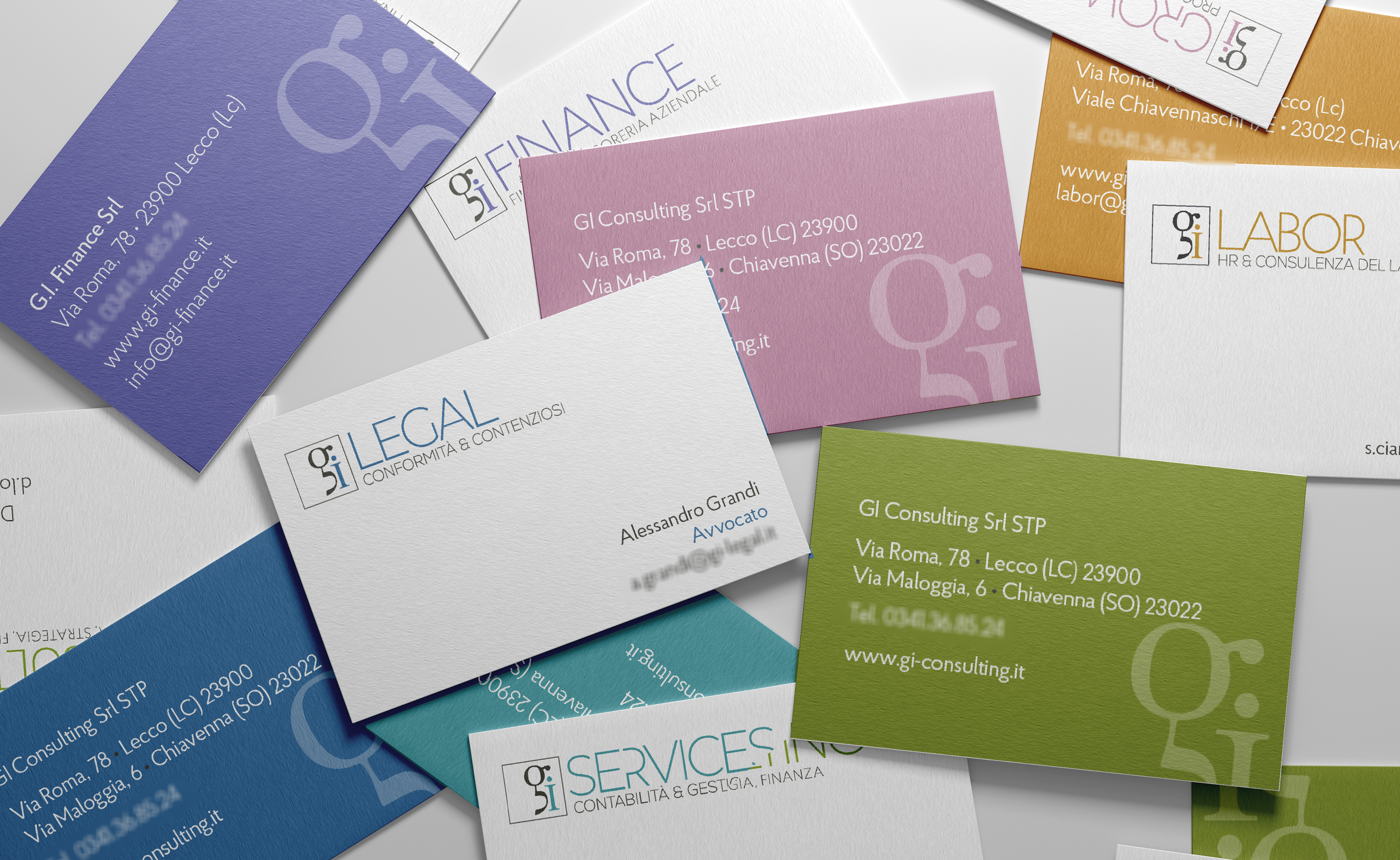
The system in everyday use: business cards and correspondence, where each division carries its own colour while the group remains legible as one.
PROJECT CREDITS & INFO:
Client: GI Consulting, Lecco, Italy
Brand strategy, naming, design system, art direction, graphic design, creative direction, brand consultancy: raffaella isidori
Time frame: 2024/2025
Type of commission: contract